

Economic Graph Experience
Linkedin EBC Graph engage EBC visitors with the six pillars of the Economic Graph, through a data-driven, tailored, interactive journey. The totem acts as a navigational dial and magnifying glass – encouraging discovery and minimizing diversion. The EBC experience connects pillars of the Economic Graph through an order of magnitude story, from a single member to a global scale.
2018.6 - 2019.1
Role: Interaction Product Design
Tools: Figma, Unreal, Maya, AfterEffect
The Client: Linkedin

The Data Experience is a single piece of a broader agenda and therefore should be immediately compelling.
How can we get the audience excited about the amazing possibilities of LinkedIn data through this single piece?


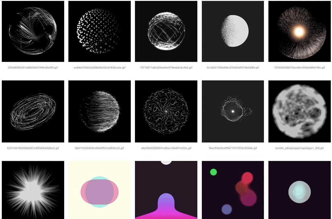
Visual and Motion Study
Visual Style Key Words:
Inspiring, Dynamic, Elegant
Motion Study Key Words:
Supportive, Relevant, Substantive


User Journey
I created the user journey to help me understand the entire experience and scenarios. There is a learning curve for users who have never been in this experience before. Therefore, it is important to consider the timeline and the onboarding time. It also helps me to design the interaction into a more intuitive way.


The totem acts as a navigational dial and magnifying glass – encouraging discovery and minimizing diversion.
The goal for interaction is to keep user heads up, focus on the projection content. Therefore, the interaction of the totem and touch table need to be lucid and intuitive, as minimal as possible.


Interaction Design of the Totem
There are two main gesture movement for the totem: Rotation and Navigation. While there are more than two functions need to be achieved by the totem. Therefore I designed a switch section at the bottom of the table. It will share responsibly of the totem.

User Interface: Projection and Table
There are two interfaces: touch table and projection, the most important principle for the interface design is consistency. I designed the shape and color based on Linkedin brand guideline, make them in one visual system.
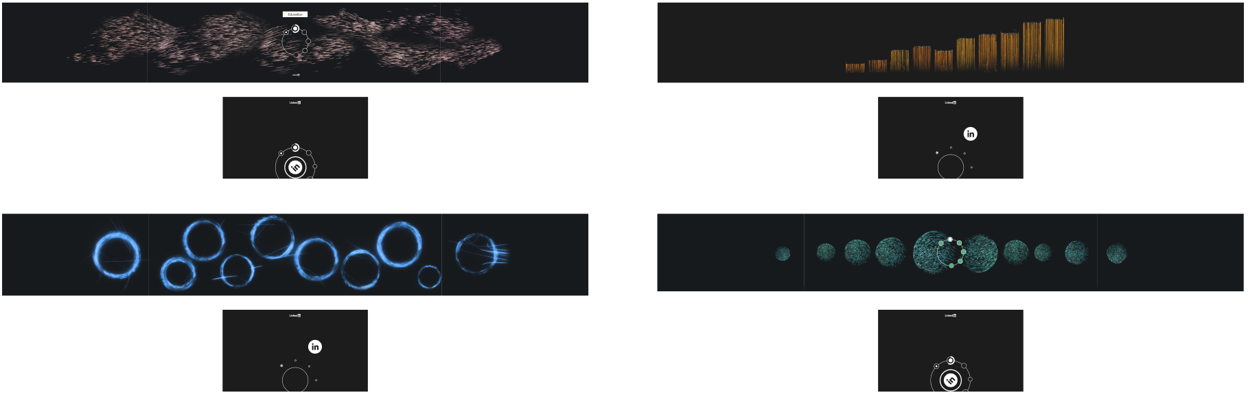
Transition Design
There are 6 pillars for 6 different data sets, the transition between them is also the key element to keep the visual consistency. The principle of this motion design mainly follow the brand shape from Linkedin, bring more brand language into the transition moment.

Prototype in VR
I use Unreal to build a VR prototype for the project, to help the team members have a sense of scale of Linkedin EBC installation.
The scale of final installation in California Linkedin campus is different from the scale of prototype in HUSH New York office. Therefore, the VR prototype can help the developer has a better sense of the scale in order to programing the graphics. Moreover, the VR prototype can help the team has the sense of scale, make sure everyone on the same page.

